This post brings together talks we gave at AI Engineer Singapore in May 2026. We approached the same change from different directions: Josh asked what happens to craft when AI can make almost anything faster; Sabina asked what it means for engineers who are now making more visual decisions themselves.
We landed in roughly the same place. The first output is easier than it has ever been. The work begins after it.
The first output is now easy
AI has raised the floor, but it has not raised the ceiling.
Josh
A sentence can become a working interface before you have finished your coffee. That is useful. It can also be disarming. The result arrives polished enough that it is easy to stop asking questions.
The problem is not that the first answer is always broken. It is that it is often plausible: the most common patterns from the most common sites, assembled into something competent and strangely certain. Nothing is necessarily wrong, but little of it tells you why this product should exist or who cared enough to make it this way.
It’s hard to articulate or put into words, but we believe that you can sense care, just as you can sense carelessness. Jony Ive said this at Vanity Fair all the way back in 2014. This is what the internet refers to when we say ‘slop’: a remarkable display of carelessness, presenting to the world the first prompt answer from AI, as if you had cared deeply about the work.
Writing good code already requires finesse and judgment. You decide what to expose, what to constrain, what to name, what to remove, and which trade-offs are worth making. Design asks you to use that same capacity on different material. AI should augment our creative abilities, not replace them. Why give the robots all the fun?
Fonts, colour, animation, spacing, and layout are increasingly easy to change. That does not make them arbitrary.
This is useful to remember precisely because AI is good at filling a page. It can add numbered sections nobody asked for, eyebrow text that adds nothing to the heading, icons that distract from the new checkout flow, and animation that delays a straightforward task.
There is no single correct place for design to begin. Sometimes you know where you want to go, so you begin with boilerplate and edit toward that direction. Other times, you understand the problem but not its final expression. You keep shifting things, trying alternatives, and noticing what begins to emerge.
Both are ways to begin, not complete design processes. The same questions eventually arrive:
- Are you solving the right user problem?
- What is the single thing this product or feature needs to do?
- What are you trying to communicate?
- What deserves attention, and what can be removed?
The work begins after the first output
New technology helps us fail faster. Good. The faster we can try something, the sooner we can learn what it is not. But more versions do not automatically produce better work.
One of the biggest mistakes Josh sees is stopping at the first prompt. The first version is rarely great; the interesting possibility is version ten. Sabina's concern begins in the space between those versions. The usual loop is generate, refresh, replace. Each new answer covers the last one.
A website is not one mysterious act of taste. It is a stack of decisions you can isolate, understand, and change.
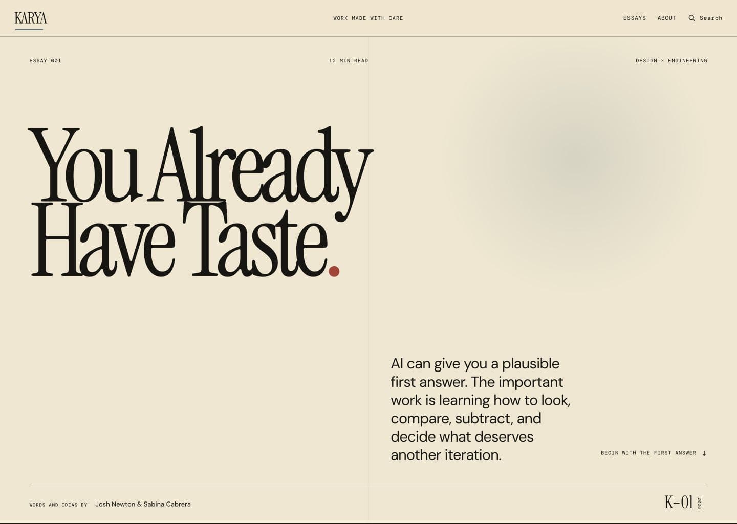
Here is an honest-to-god first shot of our website. If i recall correctly, this was made with Opus 4.8. By the time this is published there has definitely been improvements on visual output, but I think this is generally what a lot of people have to work with upon a first stab at generating ui.
I'll be focusing on the hero section for this exercise. Upon first glance this looks OK, but outside of the legible header and description (table stakes), the closer we look the more we realize there is a lot to improve.
It's good to do a quick scan of your ui and remind yourself 'What am I trying to communicate?'. Upon a glance I see we have a radial gradient that is pushing the title to be left adjusted and 2 lines. I also see a red period is not part of the intended visual branding. So let's go ahead and get rid of those!
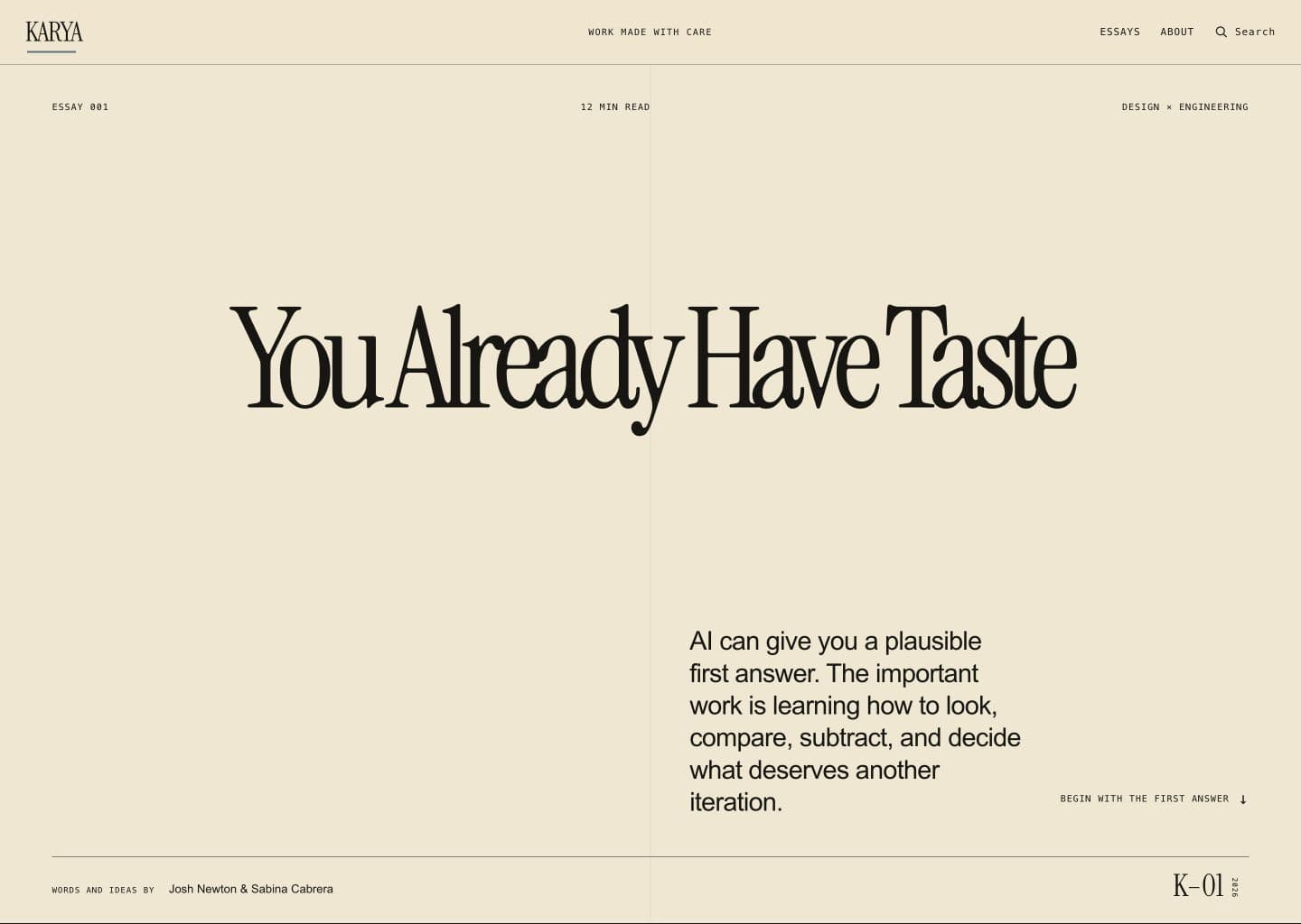
Next, let's look at the copywriting. Given we gave a prepared written document of our blog, the copy is more or less acceptable on this page. But as AI does, there are a lot of unecessary artifacts added.
'Essays, About, Search'. Given this is our first blog, there is nothing to parse, so we can go ahead and remove 'Essays' and 'Search'. Adding an about section would be nice to add context about the authors (US!) so I'll keep that but make a note to remind myself to actually make the about page. 'Work made with care' is literally what Karya means. I think it's nice so that stays. This and the following texts are considered 'eyebrow text', which is common in ai-generated designs.
'Words and ideas by' Is given, so we can remove that. 'Begin with the first answer' is a nice way to indicate that there is information beyond the hero section, but I think it's unnecessary. 'K-01 2026' is repetitive information. '12 min read' seems unecessary, given we are not a news article and the subject being about slowing down and taking time haha.
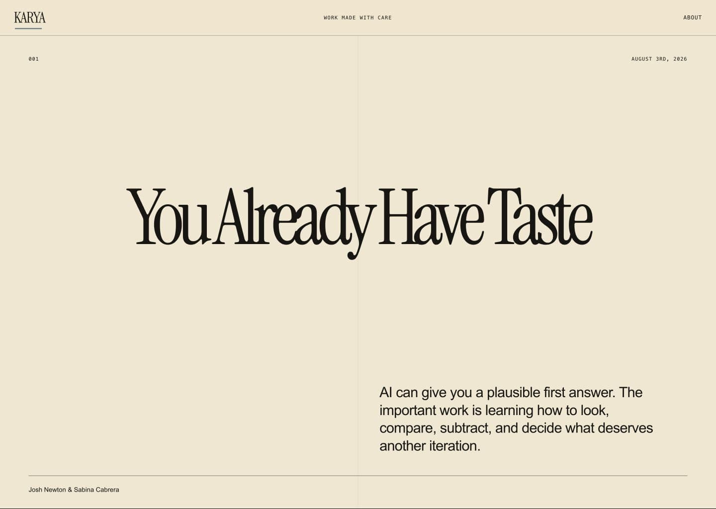
With taking away text I added what I thought was bare minimum (issue # and date published). Now let's focus on visuals. This deserves a separate post, but while there is inherently nothing wrong with beige and capitalized mono font, it is a dead giveaway of claude design. Nothing inherently wrong with this! But this post is about the work you can put in to avoid that look. SO
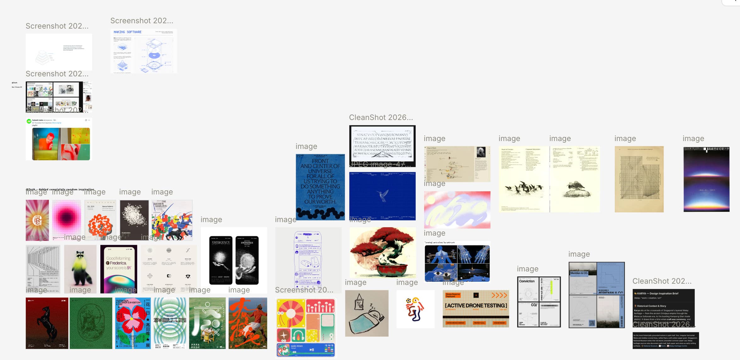
Josh and I have put some thought into the general aesthetic of this blog, so I'm going to look and see where I can find inspiration. I don't have time to generate a cool shader but I definitely want to verge away from beige.
We also have this pretty fun animation we want to feature in the hero section (Oh, link to it here.) so let's prototype that out and see how the text gets rearranged).
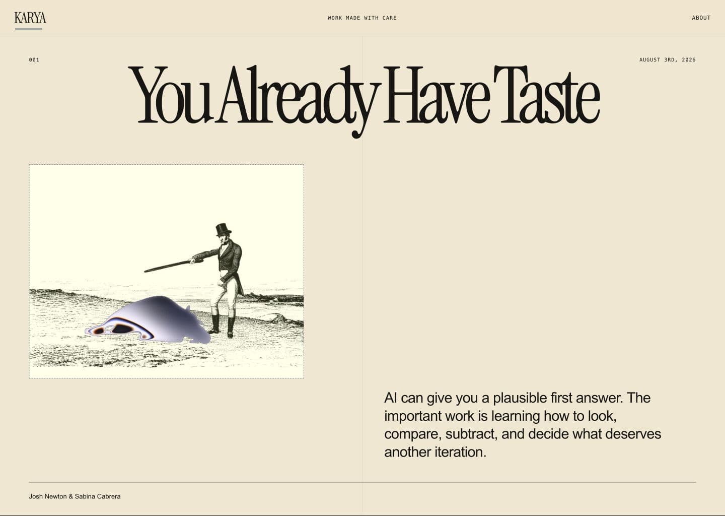
Sick. Now let's talk about the elephants in the room. First one being how inconsistent the typography is across fonts, sizing, and spacing.
It's not gospel but two fonts usually does the job. In fact, with enough opinionated spacing and combinations, Google Fonts/free fonts go pretty far. Serif + nonserif, serif + mono, etc...there are a lot of cool resources online that let you look at font pairings to see what goes best. As long as it's an easily scannable font I there's not much that can go wrong.
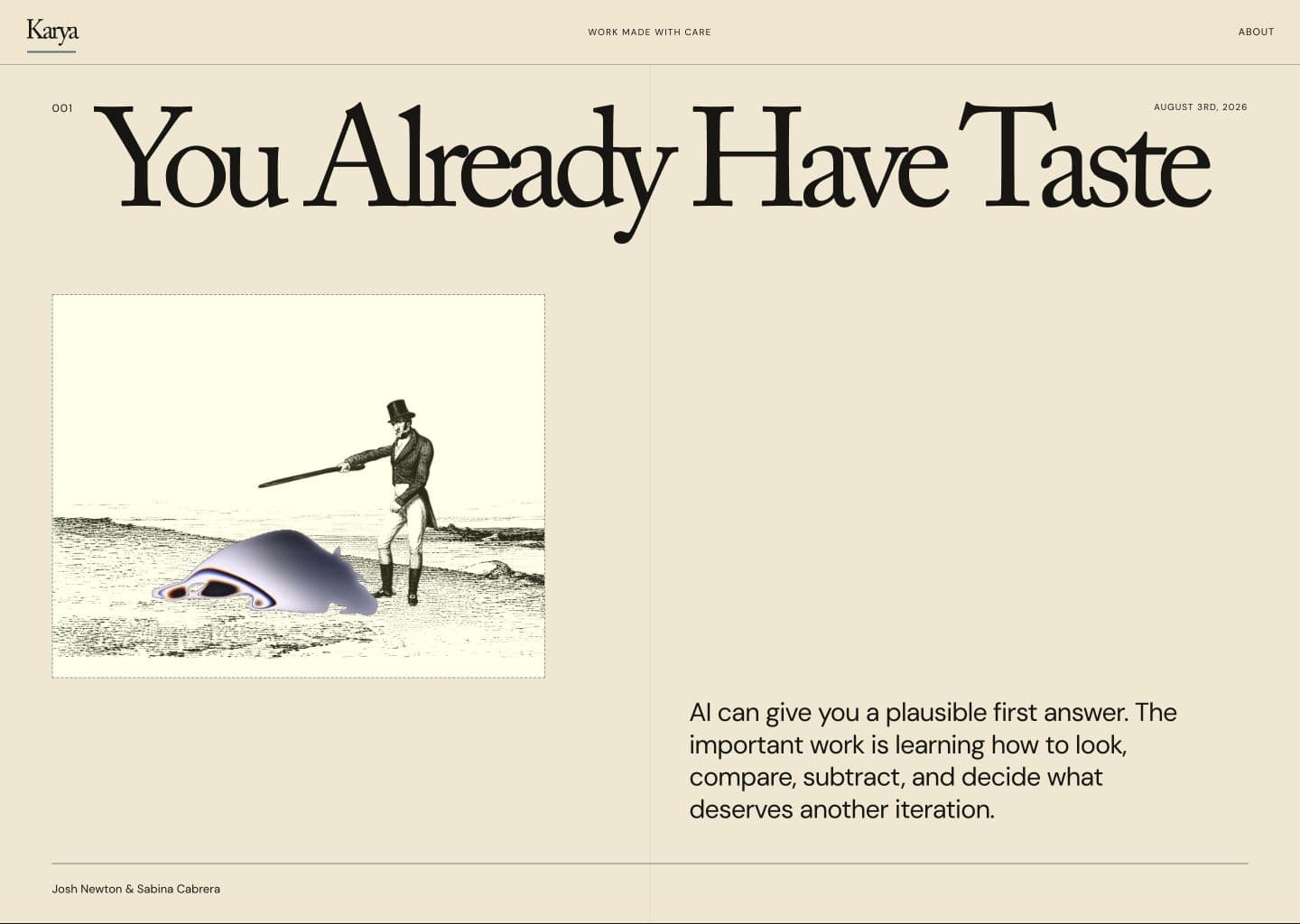
Much more consistent. Seems like we have some 10px fonts tho, so let's see what happens when we try to fix that and give the header some space...
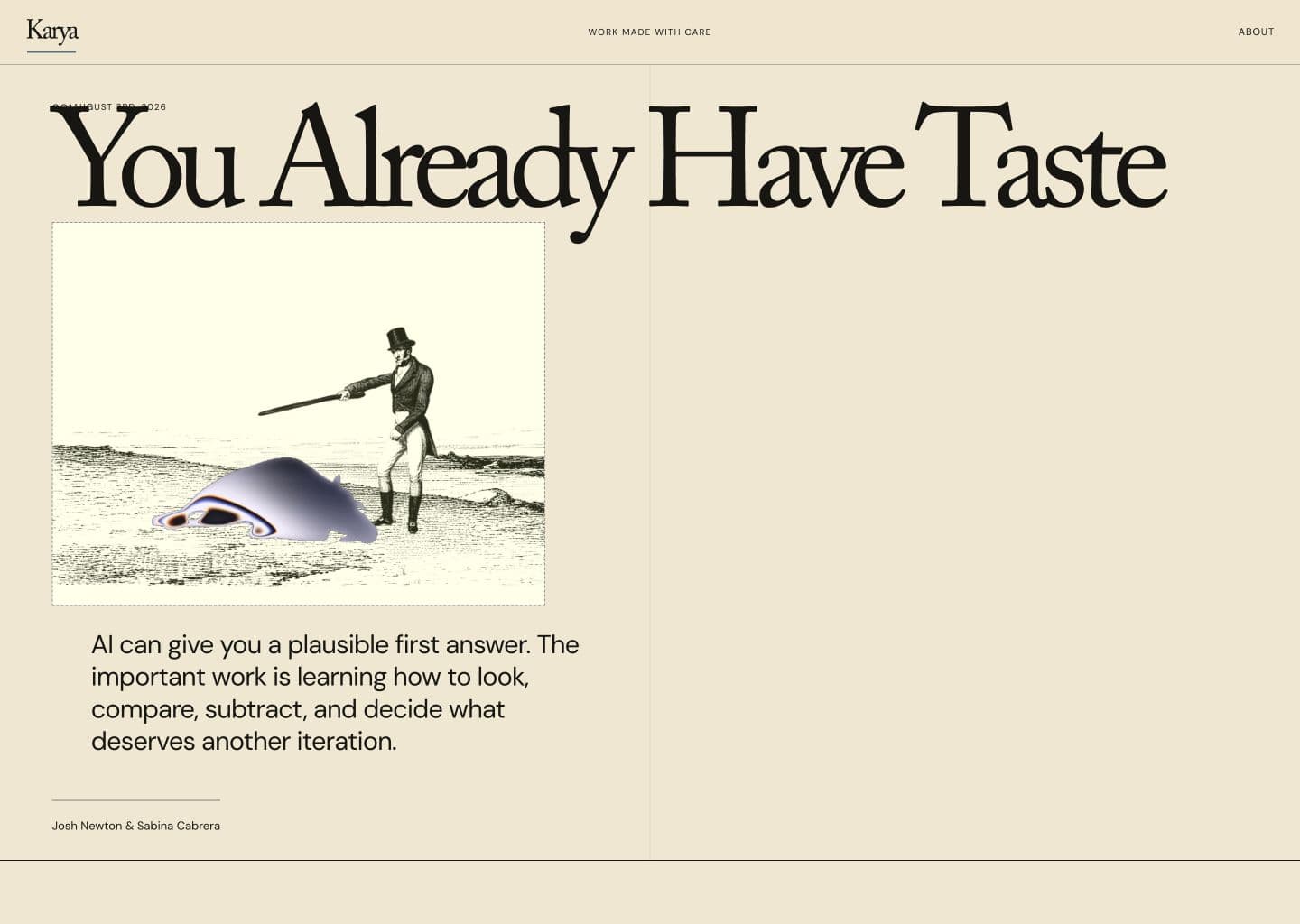
OH MY GOD! AI DIDN'T ADD AUTOLAYOUT/FLEXBOX!
THIS MEANS WE HAVE NO IDEA IF ITS RESPONSIVE!!!!
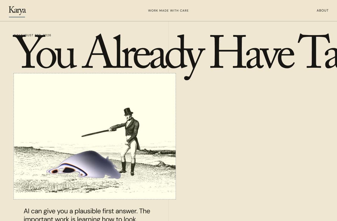
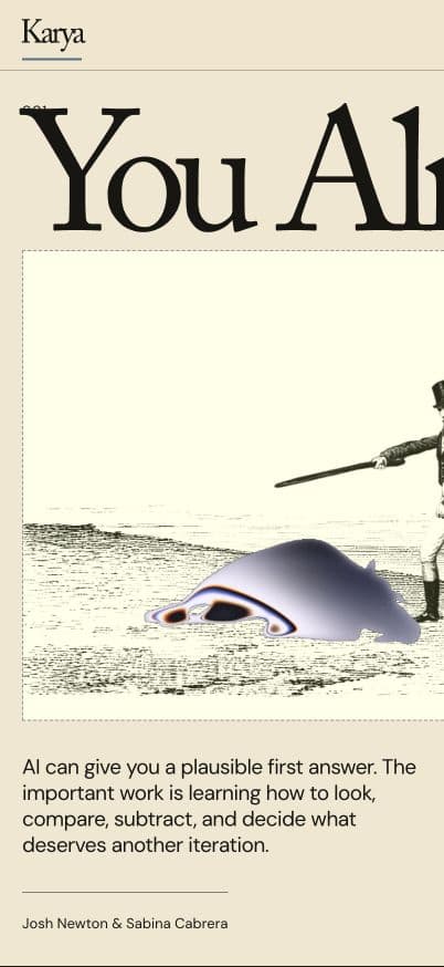
Have no fear! There are two options here.
1. You ask your AI to make your site responsive (I'm not gonna lie this is a pretty proven benchmark, saturated like 3 models ago) 2. You learn flexbox via Flexbox Froggy
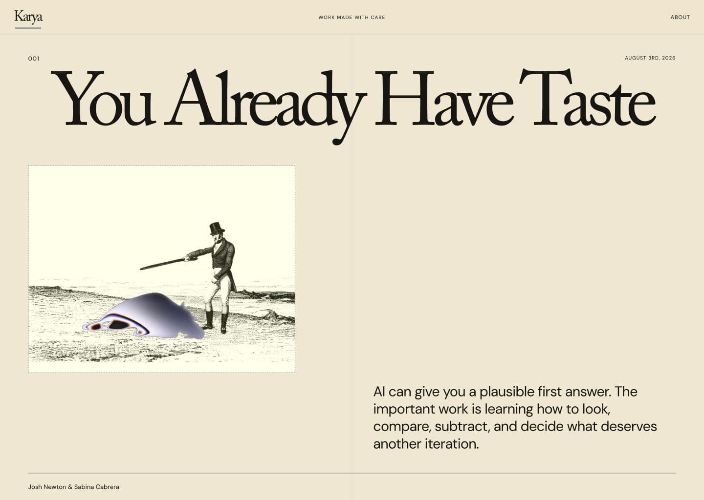
Autolayout applied. Your design should have no cosmetic changes.
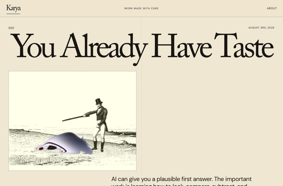
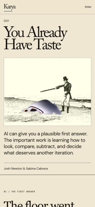
As you can see there is a clear difference between how the content resizes once it has the confines of autolayout. Now you can relax knowing your content can be opened on desktop, phone, Google Nest, whatever.
- AUTOLAYOUTAUTOLAYOUTAUTOLAYOUTAUTOLAYOUTAUTOLAYOUTAUTOLAYOUTAUTOLAYOUTAUTOLAYOUTAUTOLAYOUTAUTOLAYOUTAUTOLAYOUTAUTOLAYOUTAUTOLAYOUTAUTOLAYOUTAUTOLAYOUTAUTOLAYOUTAUTOLAYOUTAUTOLAYOUTAUTOLAYOUTAUTOLAYOUTAUTOLAYOUTAUTOLAYOUTAUTOLAYOUTAUTOLAYOUTAUTOLAYOUTAUTOLAYOUTAUTOLAYOUTAUTOLAYOUTAUTOLAYOUTAUTOLAYOUTAUTOLAYOUTAUTOLAYOUTAUTOLAYOUTAUTOLAYOUTAUTOLAYOUTAUTOLAYOUTAUTOLAYOUTAUTOLAYOUTAUTOLAYOUTAUTOLAYOUTAUTOLAYOUTAUTOLAYOUTAUTOLAYOUTAUTOLAYOUTAUTOLAYOUTAUTOLAYOUTAUTOLAYOUTAUTOLAYOUTAUTOLAYOUTAUTOLAYOUTAUTOLAYOUTAUTOLAYOUTAUTOLAYOUTAUTOLAYOUTAUTOLAYOUTAUTOLAYOUTAUTOLAYOUTAUTOLAYOUTAUTOLAYOUTAUTOLAYOUTAUTOLAYOUTAUTOLAYOUTAUTOLAYOUTAUTOLAYOUTAUTOLAYOUTAUTOLAYOUTAUTOLAYOUTAUTOLAYOUTAUTOLAYOUTAUTOLAYOUTAUTOLAYOUTAUTOLAYOUTAUTOLAYOUTAUTOLAYOUTAUTOLAYOUTAUTOLAYOUTAUTOLAYOUTAUTOLAYOUTAUTOLAYOUTAUTOLAYOUTAUTOLAYOUTAUTOLAYOUTAUTOLAYOUTAUTOLAYOUTAUTOLAYOUTAUTOLAYOUTAUTOLAYOUTAUTOLAYOUTAUTOLAYOUTAUTOLAYOUTAUTOLAYOUTAUTOLAYOUTAUTOLAYOUTAUTOLAYOUTAUTOLAYOUTAUTOLAYOUT
I cannot stress how important it is to get autolayout correct in the beginning. It's easier for responsiveness and is overall a better experience for designers and engineers to work together. UI by Mikey · MagicPath file here
Anyway, back to the design. This is where The fun part with iteration comes in! Play around with different software, models, etc. I am biased in that MagicPath is extremely handy for this.
Josh and I have been working on this async. so he made a fun tool to help experiment with type, colors, etc.
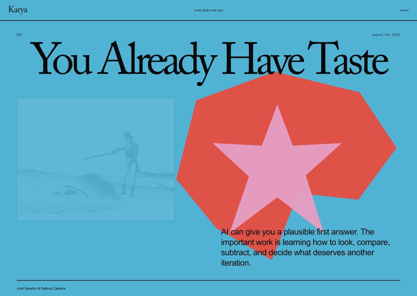
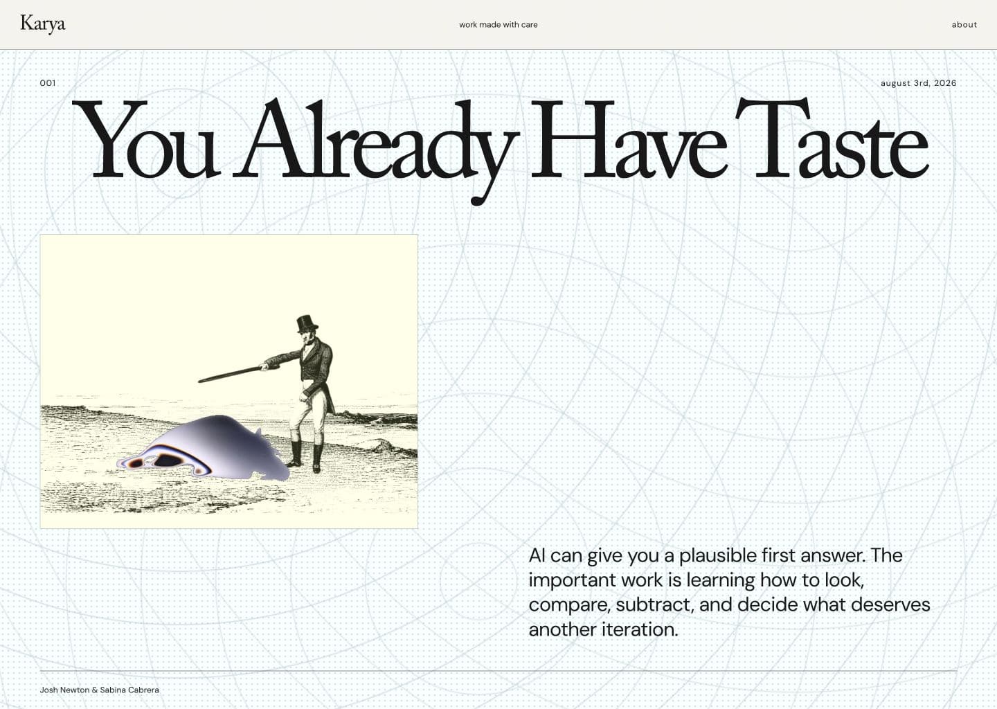
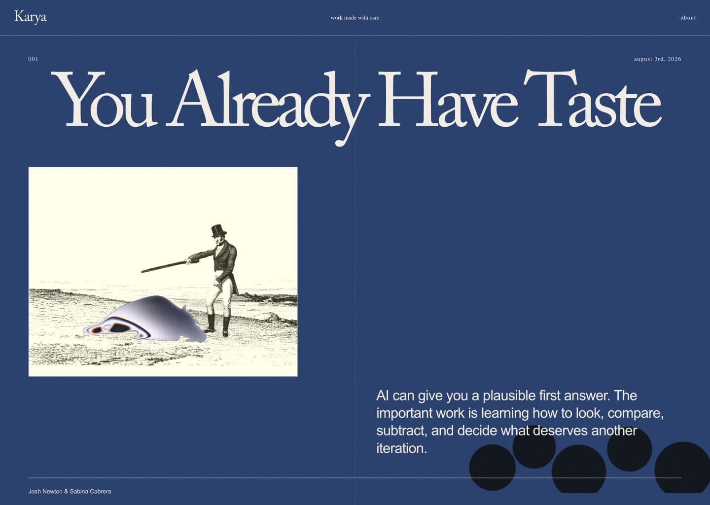
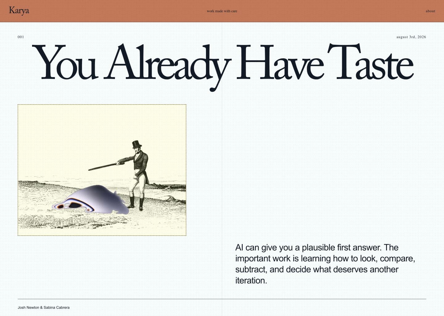
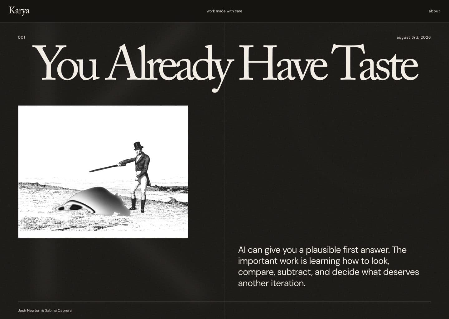
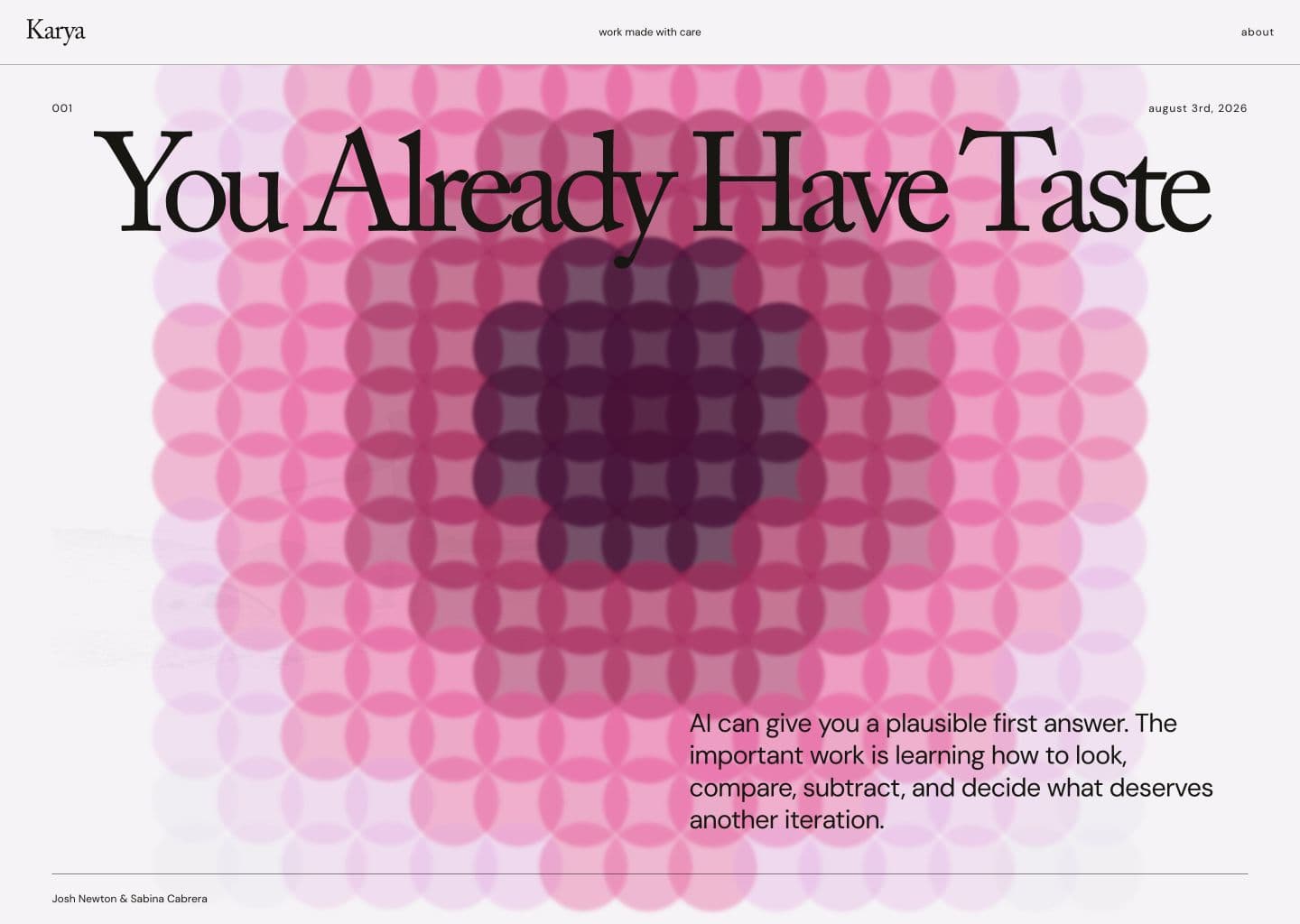
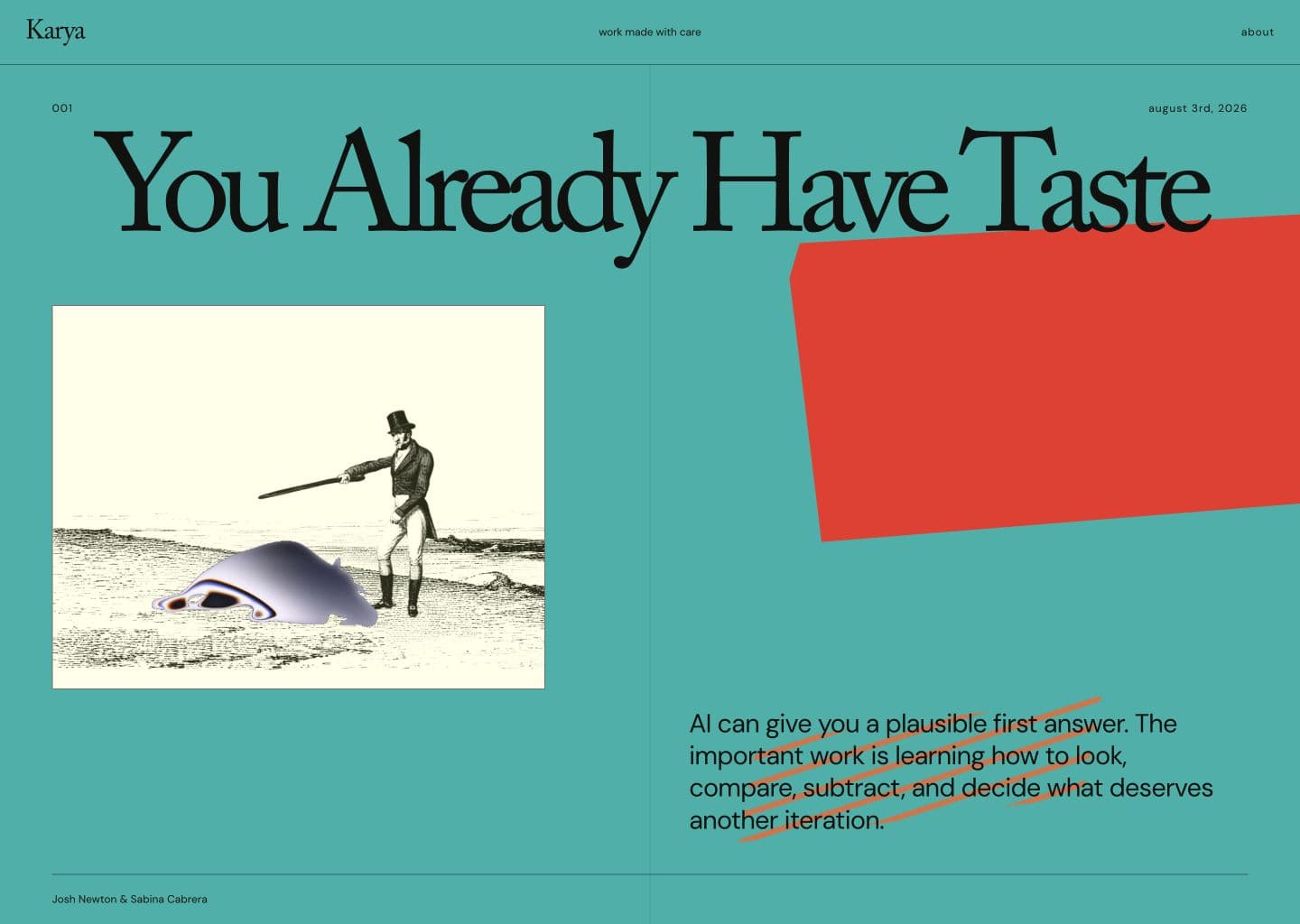
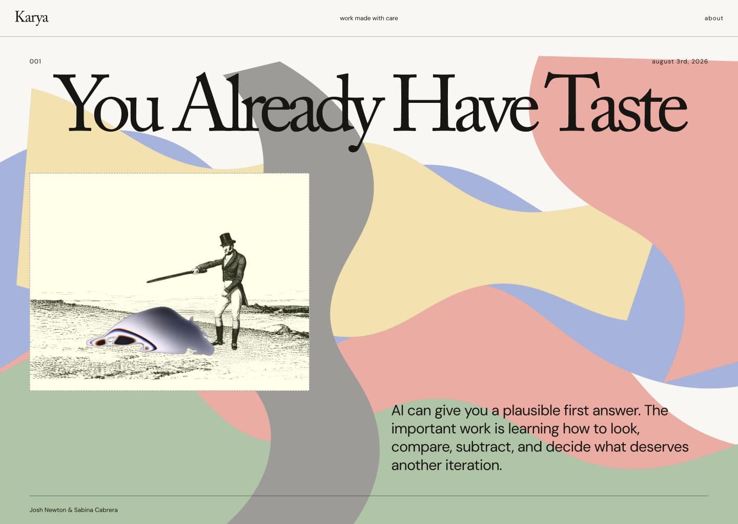
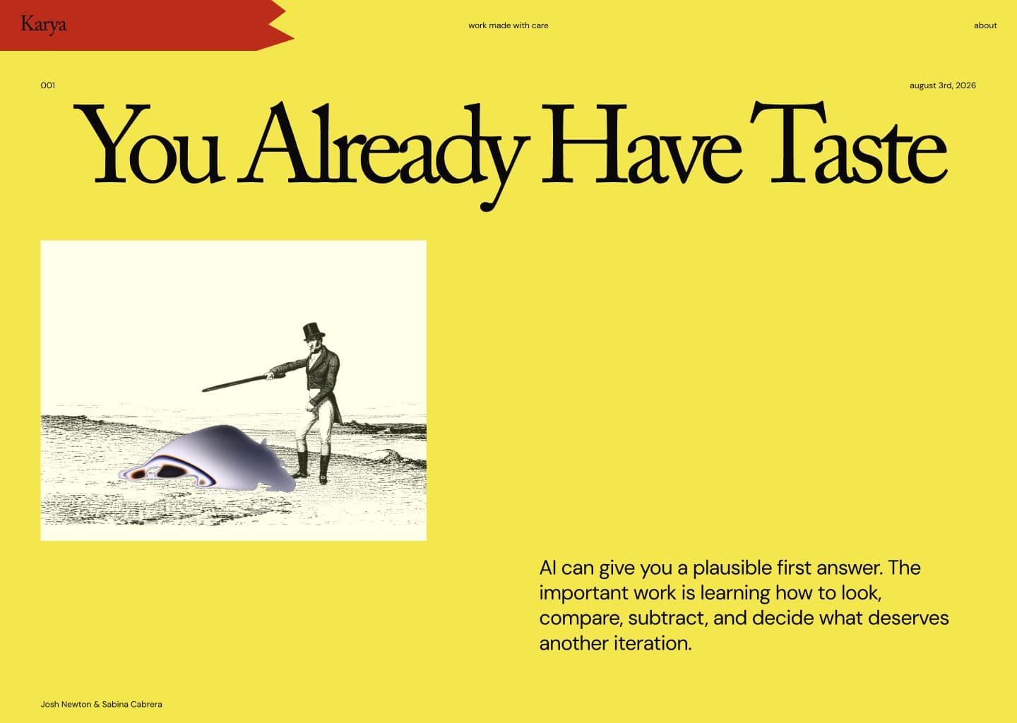
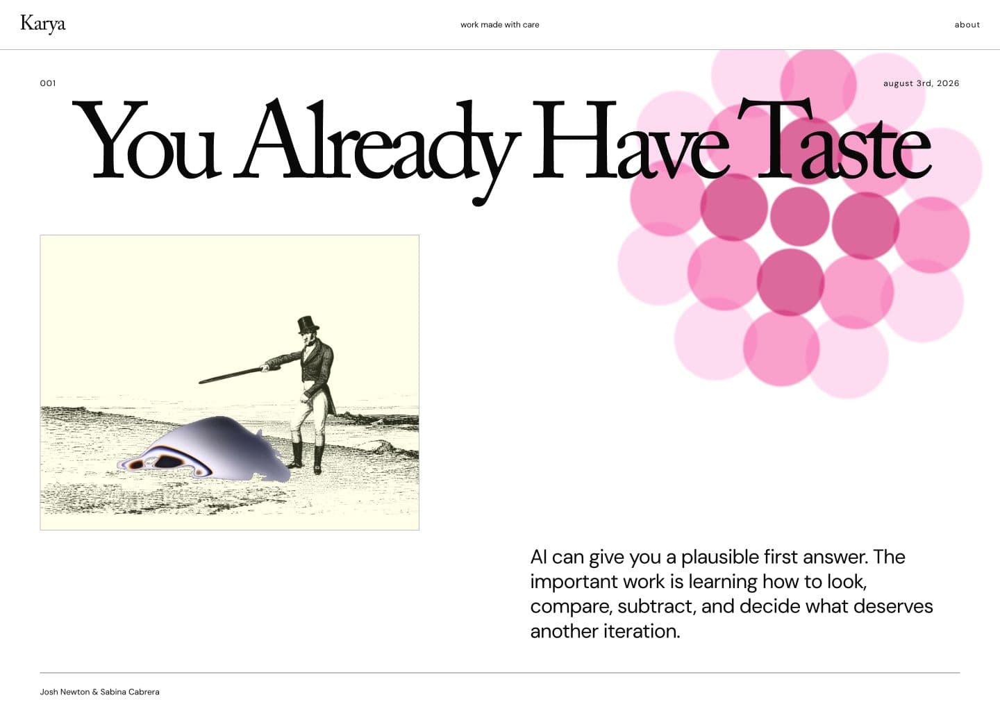
These are what happens when you reference images as inspiration and simply say "make variants inspired by _____". Nice looking at first glance! But we can definitely do some work here.
Inspiration is everywhere
Orbit, Josh’s subscription tracking app, wasn’t inspired by another app in its category. Its visual direction came from a brutally simple abstract poster on the wall of his apartment. The poster suggested a way to highlight information and help people see where they could save money.
Sabina has been finding inspiration in physical art books, picked up by wandering into bookstores. Josh has also been looking offline: posters, old books, and stretches of time away from a feed. We are rarely bored now, but boredom gives the brain room to connect patterns that were not placed next to one another by an algorithm.
Care looks like subtraction
AI makes adding things almost frictionless. That is not the same as making the product richer. Real simplicity is difficult. It requires removing clutter until what remains serves the particular people and purpose of the product.
The same care applies to borrowed systems. A skill file, design system, or template can be useful without being accepted wholesale. Look inside it. Decide which parts belong. Adapt it until you can explain what you are handing to somebody else.
Authorship remains human
The best products are made by people who put a piece of themselves into the work. The worst products feel soulless. AI has made it super easy to create soulless things at scale. But it doesn’t have to be this way.
It can be a magic pencil: a tool for building prototypes, simulating edge cases, organising research, and trying an idea while it’s still warm. It cannot take responsibility for what you put into the world or how it represents your craft.
That responsibility is the work: looking, comparing, iterating, subtracting, and caring enough to continue after the first plausible answer.
Credits & acknowledgements
- Yuwen’s article on telltale signs of AI-generated design
- Thanks to Sherry for inviting us to AI Engineer Singapore.